
The table comes in handy when we need to show big data set. It is the most effective way to see the big picture and to do comparative analysis on categorical objects.
Most tables consist of a large amount of data in rows and columns which are effectively readable in desktop view nevertheless the problem occurs when trying to give a similar experience on a mobile phone. On a small screen, if there are too many columns in a table, the user needs to swipe a lot to see the data. And as a designer, we struggle to solve this problem.
When we have no option, a common solution we provide is the horizontal scroll. But including that, there are a couple of other solutions we can use in our next project.
Let’s get started with the usual one.
Allow Horizontal Scrolling
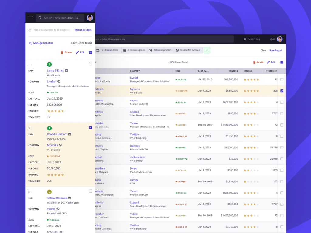
Horizontal Scrolling is probably the most common thing we usually do because it takes no effort to design. But it is a bad experience because we push oversized data into a small mobile screen. Of course, dual-axis scrolling is confusing because it’s a table where our eyes go from top to bottom or left to right, not a mobile map application where dual-axis scrolling is completely normal when we see it in mobile’s map app.
However, if you still need to use it on a table, try to fix column headers or row headers to provide some sense of place.
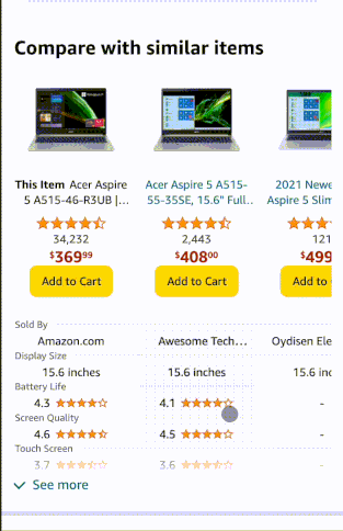
Amazon used it very wisely.
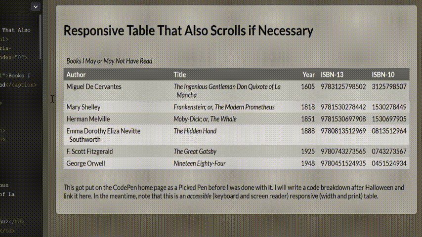
Responsive Tables
Another common approach we often see is a responsive tables view where each row becomes a small table consisting of two columns. One column is the header another is the value. This method is widely loved by developers because of its easy implementation. Just a few CSS codes and boom! It’s done.
Here is the code link in case you came to this blog to get the job done. 😄
But the problem is it doesn’t serve the purpose of a table anymore.
The table is for efficiently doing a comparative analysis on categorical objects.
Since this is not a table anymore user can’t do the analysis. Even if users want, they need to scroll many times which is painful too.
Another example:
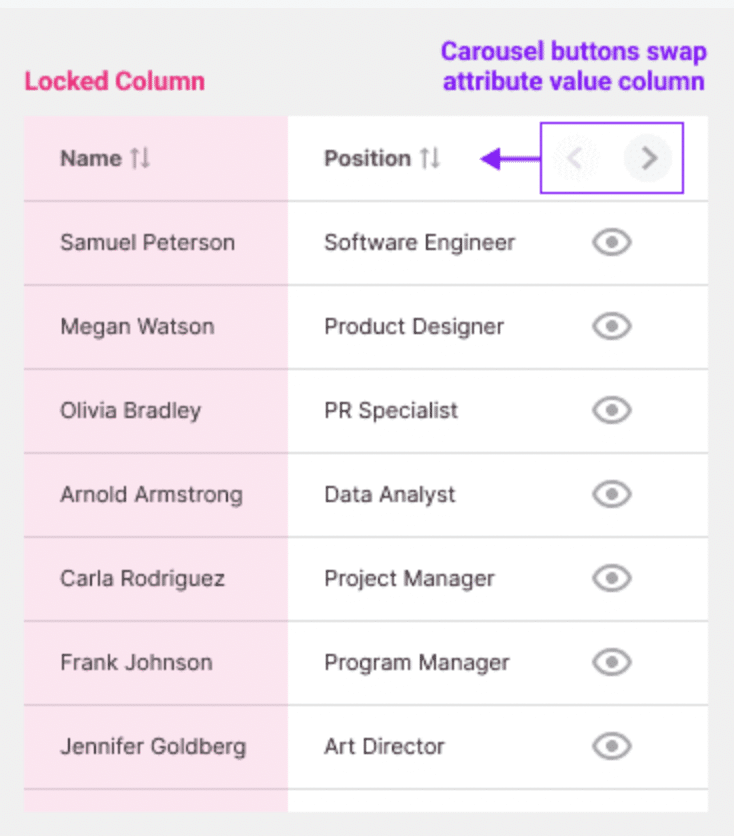
Carousel Columns for mobile view
This solution I found from Anthony in UX movement where he mentioned how we can utilize data comparing the method to make it better responsive. As mentioned in the article, user wants to compare the first column (Key ID value) with the rest of the column (Attribute Values).

The solution is simple – we will fix the “Key ID Value” and put all the “attribute values” in the carousel. The carousel will have navigation arrow keys to swap the column.
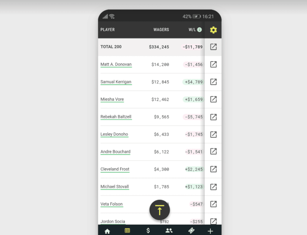
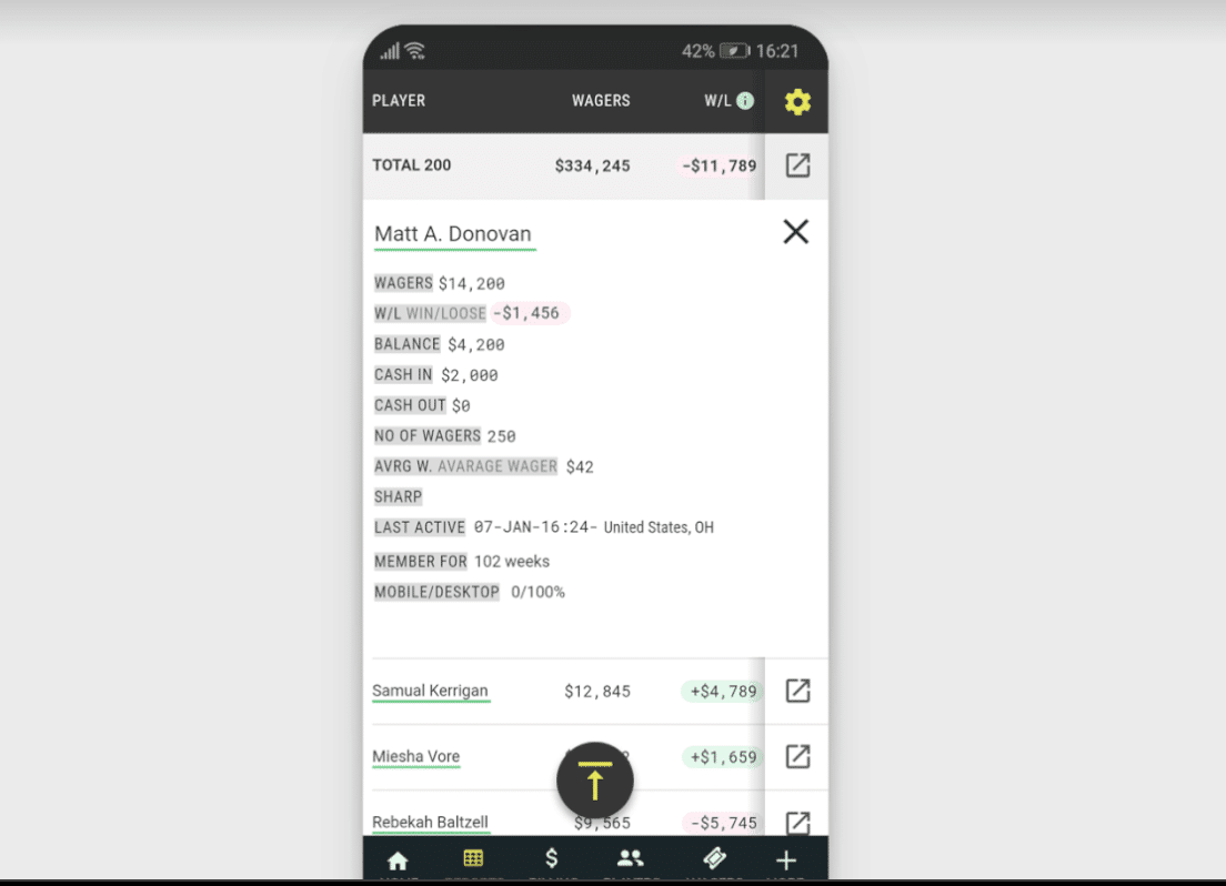
Accordion based table
When you need to display too much content in too little screen space, accordions are one of the most useful design elements. In this method, the table will only consist of 2/3 columns and the rest of the column information will be inside the pane. This approach is also useful for desktop versions when you have too many columns and you want to avoid horizontal scroll. Check out Kendo UI to learn more. wpDataTables also introduced this approach.
Removing unnecessary column
This one is understandable but the hardest one to apply. As a designer, it is a common rule to show only the necessary information but not always successful to convince the product owner to cut off less important information. They want to show all of it. But when it comes to showing on such a small screen it is better to consider omitting unnecessary information.
To conclude, choosing the right solution completely depends on what kind of data you want to show. Keep in mind how information is consumed by the users. It also depends on how cooperative the development team is in building it.

A UI/UX Designer with a background in Business Administration. He loves to explore complex problems and create experiences that work for both businesses and users.